Create a Responsive Drop down Menu in Blogger

Saturday, December 19, 2015

Create a Responsive Drop down Menu in Blogger

http://www.mybloggertricks.com/2013/06/design-responsive-drop-down-menu-in-blogger.html
Responsive Drop Down Menu in bloggerThe task of Designing a responsive blogger template starts with the Header and the most important part of Header is the top navigation menu that provides useful links to your inner pages. Responsive drop down menus are viral now and can be seen widely implemented on all wordpress blogs and even mashable.com. Today we are releasing the first ever tutorial on designing a flexible Drop down navigation menu for BlogSpot blogs without using a single script or image! The best part is that it is not just a flat menu but with a drop down list. This makes our tutorial distinguished from those several codes and plugins proposed by some Geeky friends at Github. Using simply <navHTML5 > tags and CSS3: checked selectors, we managed to design a menu that we hope would be useful to the blogger community because it is really an efficient menu that is compatible with all major browsers and uses no Jquery at all!
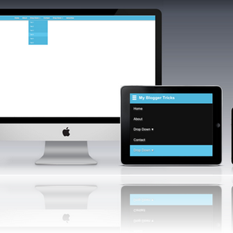
The screenshots below are taken using my personal iPhone to give you an idea of how your blog menu would look like in different screen sizes and in landscape and portrait screen mode. The menu auto adjusts itself using CSS3 media queries which we already discussed in first part of this series.
responsive drop down menu in iphone
Tip: If you are using Desktop computer then simply increase and decrease your browser window manually using your mouse and observe how menu toggles between two different styles and expands/collapses when clicked.
Tutorial Series
2: Design a Responsive Header, Menu, Sidebar, Post Content area, footer etc...
3: Using Responsive Images in Blogger..
4. Responsive AdSense Ads..  Really?
5. In Progress..
HTML5 and CSS3 is no less than a blessing that has completely eliminated the need of several JavaScript functions.  We will thus Design a beautiful Responsive menu in blogger using some extremely easy steps. Lets start coding!

What have we planned?

For this tutorial to work for most of those who are not well versed in web designing, I suggest you remove all your existing menus and use this responsive one instead which will remain fixed at the top of the screen like a sticky menu. It is really easy to add a menu this way. You can then add all your links inside this new menu.

Disable Mobile Template

Note If you have activated mobile view for your blog then you must first disable it by going to:
  1. Blogger > Template
  2. click the gear icon
  3. Select No. Show desktop template on mobile devices.
  4. Save

Add a Responsive Menu To Blogger

  1. Go To blogger > Template
  2. Backup your template
  3. Click Edit HTML
  4. Search for these lines or similar. These lines of code exist at the top section of your template
<b:if cond='data:blog.isMobile'>
<meta content='width=device-width, initial-scale=1.0, user-scalable=0' name='viewport'/>
<b:else/>
<meta content='width=1100' name='viewport'/>
</b:if>
Replace all the above code with our custom Meta ViewPort code:
<meta content='width=device-width, initial-scale=1, maximum-scale=1' name='viewport'/>
<meta content='text/html; charset=UTF-8' http-equiv='Content-Type'/>

I have also included a UTF-8 character set for using some Special characters instead of images.
   5. Now Search for </b:skin>.  Click the black arrow to expand the code.
compressed blogger stylesheet
   6.  Paste the following Styles just above </b:skin>
/*-----Responsive Drop Down Menu by MBT ----*/
body {
margin: 0px;
}
#menu{
background#50B7DC;
color: #FFF;
height: 40px;
border-bottom: 2px solid #DDD;
box-shadow: 1px 2px 9px #B1B1B1;
border-top: 2px solid #DDD;
}
#menu ul,#menu li{margin:0 auto;padding:0 0;list-style:none}
#menu ul{height:45px;width:1024px}
#menu li{float:left;display:inline;position:relative;font:bold 0.9em Arial;text-shadow: 1px 2px 4px #838383;}
#menu a{display: block;
line-height: 40px;
padding: 0 14px;
text-decoration: none;
color: #FFF;
}

#menu li a:hover{
color: #E4E4E4;
-webkit-transition: all .1s ease-in-out;
-moz-transition: all .1s ease-in-out;
-ms-transition: all .1s ease-in-out;
-o-transition: all .1s ease-in-out;
transition: all .1s ease-in-out;
background#5FC6EB;
}
#menu input{display:none;margin:0 0;padding:0 0;width:80px;height:30px;opacity:0;cursor:pointer}
#menu label{font:bold 30px Arial;display:none;width:35px;height:36px;line-height:36px;text-align:center}
#menu label span{font-size:16px;position:absolute;left:35px}
#menu ul.menus{
height: auto;
overflow: hidden;
width: 170px;
background#50B7DC;
position: absolute;
z-index: 99;
display: none;
}
#menu ul.menus li{
display: block;
width: 100%;
font:normal 0.8em Arial;
text-transform: none;
text-shadow: none;
border-bottom: 1px dashed #31AFDB;
}
#menu ul.menus a{
color: #FFF;
line-height: 35px;
}
#menu li:hover ul.menus{display:block}
#menu ul.menus a:hover{
background#5FC6EB;
color: #FFF;
-webkit-transition: all .1s ease-in-out;
-moz-transition: all .1s ease-in-out;
-ms-transition: all .1s ease-in-out;
-o-transition: all .1s ease-in-out;
transition: all .1s ease-in-out;
}
@media screen and (max-width: 800px){
  #menu{position:relative}
  #menu ul{background:#111;position:absolute;top:100%;right:0;left:0;z-index:3;height:auto;display:none}
  #menu ul.menus{width:100%;position:static;padding-left:20px}
  #menu li{display:block;float:none;width:auto; font:normal 0.8em Arial;}
  #menu input,#menu label{position:absolute;top:0;left:0;display:block}
  #menu input{z-index:4}
  #menu input:checked + label{color:white}
  #menu input:checked ~ ul{display:block}
}

Customization:
  • To change the menu background edit:#50B7DC
  • To change the background color on hover edit: #5FC6EB
   7.  Now search for <body>    Just below it paste the follow code which will create the menu structure:

<nav id='menu'>
<input type='checkbox'/>
<label>&#8801;<span>My&#160;Blogger&#160;Tricks</span></label>
<ul>
<li><a href='/'>Home</a></li>
<li><a href='#'>About</a></li>
<li><a href='#'>Drop Down <font size='1'>&#9660;</font></a>
<ul class='menus'>
<li><a href='#'>Tab 1</a></li>
<li><a href='#'>Tab 2</a></li>
<li><a href='#'>Tab 3</a></li>
<li><a href='#'>Tab 4</a></li>
<li><a href='#'>Tab 5</a></li>
<li><a href='#'>Tab 6</a></li>
</ul>
</li>
<li><a href='#'>Contact</a></li>
<li><a href='#'>Drop Down <font size='1'>&#9660;</font></a>
<ul class='menus'>
<li><a href='#'>Tab 1</a></li>
<li><a href='#'>Tab 2</a></li>
<li><a href='#'>Tab 3</a></li>
</ul>
</li>
<li><a href='#'>Advertise</a></li>
       </ul>
    </nav>
Customization:
  • Replace the text My Blogger Tricks with your blog title.
  • To add spaces between words use the unicode &#160;
  • I am sure you know how to create new tabs but to create a tab for a drop down list use the following format:
Paste the following code below <ul> or above </ul> to create a drop down list:
<li><a href='#'>Drop Down <font size='1'>&#9660;</font></a>
<ul class='menus'>
<li><a href='#'>Tab 1</a></li>
<li><a href='#'>Tab 2</a></li>
</ul>
</li
The above menu will create only one drop down list and not multi-level drop down lists because it makes no sense to complicate the design layout for mobile devices. Keeping it simple is best.
  8.  finally save your template and you are all done!
Now play with your browser window and adjust its size manually to see it working just perfectly! :)

Need help?

In the above example, the Main Menu is automatically set to display:none when the screen size width is below or equal to 800px . I used checkboxes to introduces the toggle effect. So as soon as the screen size reaches 800px or further decreases, the CSS media queries detects it and automatically set the mode of the box to checked and apply the styles. This is an interesting technique that we utilized here which eliminated the need for JQuery toggle function.
I have used only two major break points and that is width:1024px  for Desktop computer Screens and 800px for devices which include Tablets, ipads and smart phones. So the entire concept is made extremely easy. I am sure those who understood the above tutorial will find it really interesting to customize it further and add further elements to the menu like a responsive search box at right corner or a RSS Icon etc.
Please let me know if you want any help here. I hope this technique would further help developers to create more interesting blogger templates and contribute further to the blogosphere community. I would love to hear your feedback on this. Please let us know of your precious views so that we could improve it further if needed. Peace and blessings buddies :)

Floating Vertical Menu For Blogger

Monday, June 22, 2015

Floating Vertical Menu For Blogger

Floating vertical menu for blogger | 101Helper blogger menus

Change Widget Background Color

Change Widget Background Color

In our article on Background Image for Blogger Template, we had explained how to have a background color or background image in the body, main posts, or sidebars. This will apply to most blog templates except templates like TicTac. Instead of having the entire sidebar in one color, you can also assign a different color to each of the widgets. This guide will let you know how you can change the background color of each individual widget.

Let us assume that you have created a Link List via Template -> Page Elements -> Add a Page Element. If your Link List has no title, temporarily assign to it a title. Next, go to Template -> Edit HTML and press Ctrl+F to search for that title.

"Loading" animation before loading page

Friday, June 12, 2015

add this line in as shown above
<div class='preloader-overlay' id='preloader__html'>
<aside class='loader'>
  <div class='loader-center'>
    <div class='chars'>
      <span class='char brace'>{</span>
      <span class='dots'>
        <span class='char dot _dot-1'>.</span>
        <span class='char dot _dot-2'>.</span>
        <span class='char dot _dot-3'>.</span>
      </span>
      <span class='char brace'>}</span>
    </div>
    <h6 style='letter-spacing:4px;'>Loading..</h6>
  </div>
</aside>
</div>

Drop Down lables for blogger

Thursday, June 11, 2015
http://www.blogs911.com/2013/08/HowtoMakeaDropdownMenuforLabelsinBloggerBlogs.html

How to Create a Sitemap or Table of Contents in Blogger

Thursday, June 4, 2015


How to Create a Sitemap or Table of Contents in Blogger 
One of the limitations of a blog is that it doesn't have an index or sitemap of the site that could make it easier for readers to find content that they are searching for. While the blog archive and labels have all the information about the published post, these do not appear on a single page completely, so searching for more posts is not always easy. Luckily, this gadget will help you to add a table of contents or sitemap on Blogger showing the index of all posts separated by categories that have been published. It will also show the latest posts with a text saying New! Demo: You can see it working by clicking here. How To Add a Sitemap with a List of Posts to Blogger To implement it on your blog, follow the steps below: Step 1. Login to your Blogger Dashboard and select your blog Step 2. Go to Pages > click the New Page button and select Blank page Step 3. Click on the HTML tab and paste the following code inside the empty box: “ After adding the above code, replace http://helplogger.blogspot.com with the address of your blog. Customization: ­ to change the color and font size of categories title, replace the values in red ­ to change the color of the links, replace the value in green Step 4. Click Options on the right side and select Don't allow (hide existing) for the reader's comments Step 5. Finally, click the Publish button and View the page. That's all! The index of the posts is sorted alphabetically and is updated automatically each time a new post is published


Customize Contact Form of Blogger

Monday, April 20, 2015
http://www.widgetgenerators.com/2013/05/customize-contact-form-of-blogger.html